The Nyquist Plot
by Pat Brown
The Nyquist plot is a powerful tool for examining audio filters, both analog and digital. It has been added to the latest version of Filter Hose.
I’ve had many instruments come and go through the years. The “wall of shame” in my office holds many “have to have” gadgets that have been obsolesced by technological advancements. Fortunately, I also have a toolset that will never become obsolete. These are the knowledge tools gifted by the likes of Don Davis, Dr. Eugene Patronis, Richard Heyser, Neil Muncy, and many others.
In the mid-1980’s, against the advice of my banker, I purchased a TEF analyzer. Both the analyzer and it’s manual was complete Greek to me, but I knew that I needed to master both. I was a young audio pup and planned to be in the business for awhile. SynAudCon proved to be invaluable to this end, as Don was writing a lot about TEF. The topics of his writings included
- The Domain Chart (Bruel and Kjaer)
- The Impulse Response
- The Transfer Function
- The Heyser Spiral
- The Nyquist Plot
These still form the bedrock of electro-acoustic testing. The last two are more for contemplation than solving problems, as they yield insights into the meaning of the physical measurements that we make.
The Nyquist Plot
My favorite is the Nyquist plot. While I probably won’t whip out a Nyquist Plot when tuning my next system or producing a spec sheet, I will use it in the meantime to gain insight into the meaning of the more mainstream impulse response and transfer function measurements made of filters, loudspeakers, etc. Historically, many advancements in science have resulted from looking at the same data in a different way. The phase response yields deeper insight into the magnitude response, and the Nyquist plot yields deeper insight into the phase response. There’s a lot there so fasten your seat belt.
A Modern Incarnation
Support for the Nyquist has languished in modern measurement systems since it’s not the sort of thing you would show to a customer. Until recently I’ve had to go to my oldest measurement platforms to use it, but that has changed. The latest version of Filter Hose™ (FH) includes a Nyquist Plotter (NP). The interest and inspiration for its inclusion in FH came from audio guru Langston Holland. I am happy to carry the torch further by using it in our OptEQ™ seminar and penning some instructional articles. Thank you to Xian Yu for the programming. You have seen her work if you have the SynAudCon CAFViewer™. She and her husband Hadi Sumoro – co-owners of HX Audio Lab and developers of Filter Hose™ – have been generous enough to include Nyquist Plotter in the free version.
Overview
Figure 1 shows an excerpt from the Bruel and Kjaer domain chart. This is the road map for all measurement systems, and it is fundamental to understanding the data produced by our mainstream measurement programs. The “money” measurements are the impulse response (IR) and transfer function (TF) and most measurement programs jump directly to them. I have highlighted them in the figure. But, there are other useful ways to view the data, along with some intermediate steps that can yield insight, even though we skip them en route to the main plots.
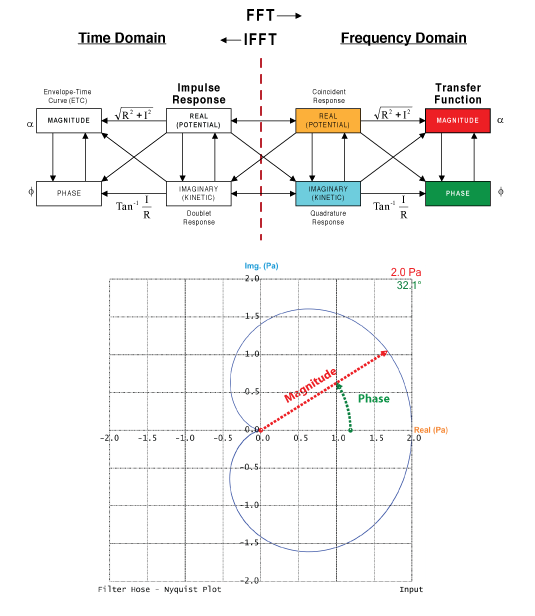
Figure 1 – An excerpt from the Bruel and Kjaer domain chart. A Nyquist plot is shown with the magnitude and phase of a data point labeled.
The Nyquist lies in the frequency domain. It is a single plot that displays ALL of the data that results from applying the FFT to the IR. These include the real (R) and imaginary (I) data – the intermediate step in computing the TF. The TF includes the frequency response magnitude and frequency response phase. The TF is generally displayed on a Bode plot – a plot of level vs. frequency (Figure 2). This is our preferred view for performing equalization chores, but examining the same data on a polar plot can be instructive. The Nyquist plot may be presented using the Cartesian coordinate system or a polar coordinate system. NP provides both.

Figure 2 – A Bode plot is shown on the right.
The Nyquist plot becomes self-explanatory if we examine its parts. It replaces the two plots that make up the transfer function (mag + phase) with a single plot depicting a rotating phasor. Using a polar coordinate system, the magnitude is the length of a phasor and the phase is the angle between the phasor and the zero degrees reference (3 o’clock). The frequency axis extends out from the page. If drawn in 3D we have the Heyser Spiral in the frequency domain (Figure 3). Richard Heyser loved plots such as these due to the insights they provide into the nature of signals and systems.
So there you have it, R + I + mag + phase all on one information-dense plot.
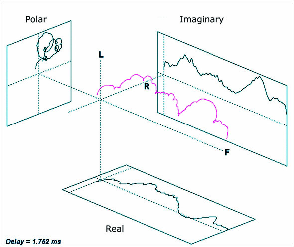
Figure 3 – The Heyser Spiral in the frequency domain
Filter Hose
Filter Hose displays the impulse response (IR) in the left window, and the transfer function (TF) in the right (Figure 2). The TF shows the magnitude and phase that result from applying the FFT to the IR. The magnitude is in dB and the phase is in degrees. A point on the magnitude plot shows “how much” and the corresponding point on the phase plot describes its phase relationship to the other points. The magnitude plot may be in relative (dB) or absolute (dB-SPL) units. A right-click on the TF plot presents a submenu where Nyquist Plotter can be selected (Figure 4).
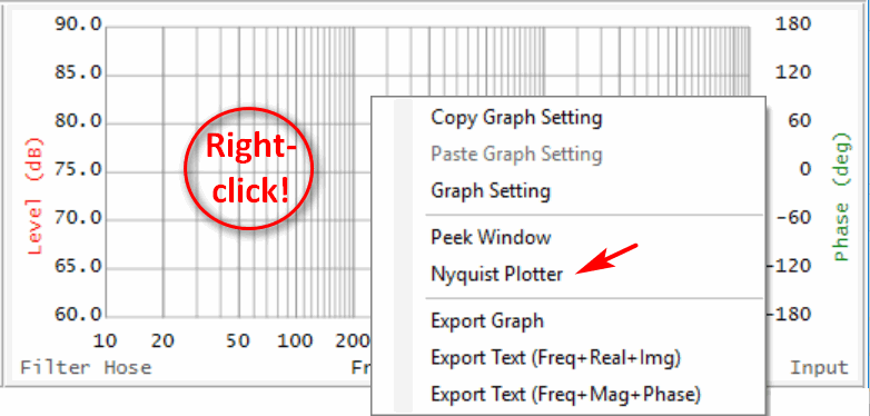
Figure 4 – Launching Nyquist Plotter in FH from the TF window
Nyquist Prerequisites
For the phase data in either the TF or the Nyquist plots to make sense, the proper time reference must be established. If it is incorrect the “phase wrapping” will obfuscate the desired response (Figure 5). We need to take a snapshot of the signal at a point of observation that excludes the time it spends getting there – the time of flight (ToF). In FH the fastest way to estimate the correct time reference is to select “Max to 0” next to the IR. This will move the amplitude max to relative time zero and unwrap the phase plot (Figure 6). This removes any ToF delay and reveals the measured phase response of the device-under-test (DUT). Note that in FH the user is free to tweak the time reference with left and right arrows and that each time it is incremented the slope of the phase plot will change. What’s the right setting? They’re all “correct” relative to the time reference that you pick. Comparing the measured phase to the minimum phase response (selected under the Advance menu) can be helpful. This will reveal how the measured phase compares to the minimum phase response calculated from the magnitude response using the Hilbert transform.

Figure 5 – The proper time reference must be established for viewing the phase response.

Figure 6 – Selecting “Max to 0” establishes a time reference for the phase response that can still be tweaked by the user.
Delay vs. Phase Shift
Both delay and phase shift will move the phasor on the Nyquist. Delay always moves it clockwise due to the negative-going phase angle (Figure 5). Phase shift can move it in either direction. The delay must be removed to reveal the phase shift. The phase shift is not delay, it is phase shift. While sometimes they appear to be the same thing it is important to make the distinction. Otherwise, we will encounter apparent contradictions when analyzing signals.
Here’s an example. Does Figure 7 illustrate delay or phase shift? The answer is “indeterminate.” It is impossible to tell from the information given. While they are displaced on the time axis, this could be due to either delay or rotation.
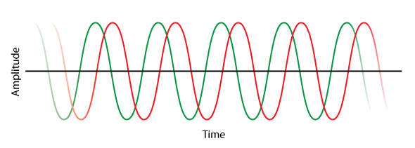
Figure 7 – Two sine waves. Is the offset caused by delay or phase shift?
On a time domain plot delay moves the waveform down the time axis. Phase shift rotates the waveform about the axis. These can appear to be the same thing, but they are not. An important distinction is that phase shift can be compensated with a network (e.g. all-pass filter) but delay cannot.
Both delay and phase shift move the phasor on the Nyquist plot. As with the TF phase plot, for the Nyquist to have meaning, the delay must be properly removed to reveal the phase shift – examples forthcoming (Figure 8).
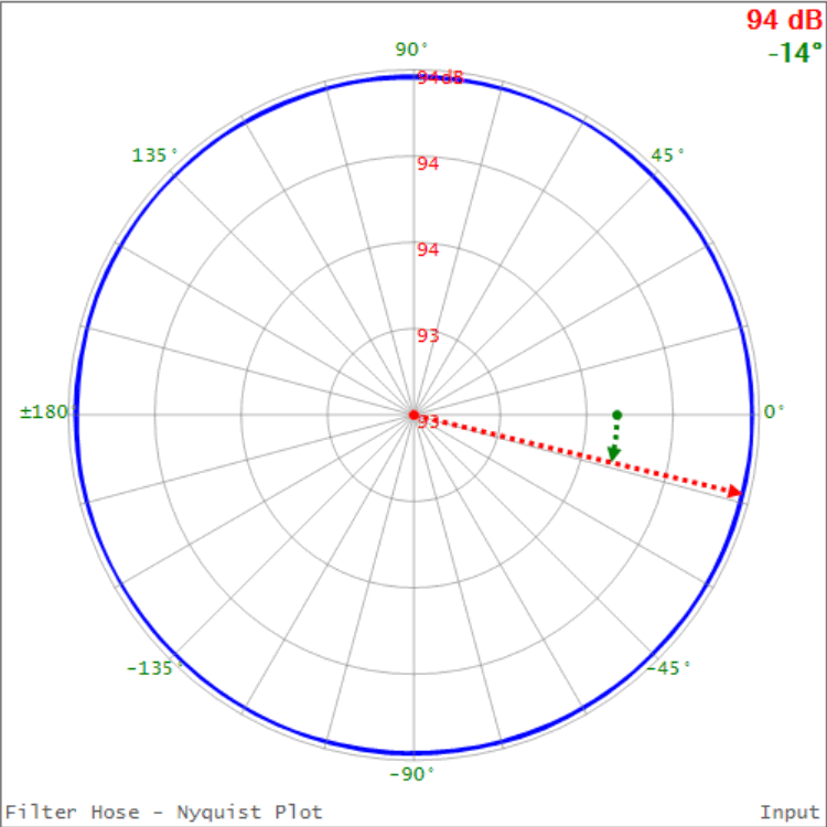
Figure 8 – A Nyquist plot of the TF shown in Figure 5. Phase wrapping on a TF displays as orbits on a Nyquist.
Causality
Time always marches forward, and a phase response slope caused by delay will always be negative-going with increasing frequency. A positive slope means that all or part of the signal arrived before the selected time reference, and this makes the Nyquist rotate counter-clockwise with increasing frequency. This “acausal” behavior requires a tweak of the time reference. The best way to arrive at the proper time reference is to observe the TF and Nyquist simultaneously while moving the time reference in the IR window. When the phase response has the minimum wraps (and the Nyquist the minimum orbits) you have arrived.
In a plot of the TF, magnitude response changes are accompanied by phase response changes. That’s because magnitude changes are caused by filters, and filters produced phase shift. The “filter” may in intentional or unintentional, as each bump or dip in the magnitude response is essentially a filter. Loudspeakers (and rooms) have lots of them. One way to describe the equalization process is that it uses intentional filters to correct unintentional ones.
Nyquist Plotter In Action
The Nyquist plot is ideal for analyzing filter responses. Loudspeakers are bandpass filters, but let’s not go there yet. Their behavior is far more complicated than that of electrical filters, so I will save them until Part 2. For the rest of this article, I’ll present some reference cases that help explain the Nyquist and aid in its interpretation beginning with a simple case and then adding complexity. Of course when making system measurements we are starting with complexity and working backward toward simplicity, identifying the things we can correct along the way.
Ex. 1 – Dirac Delta Function
Perhaps the most boring Nyquist of all is that of a Dirac delta function – a perfect impulse in the time domain. The transfer function has a perfectly flat magnitude response and a perfectly linear phase response. On the Nyquist plot, this places every data point at the same place on the X-axis, all at zero degrees phase. This is a theoretical entity that describes a “straight wire” response. From this point on, everything we pass the signal through will modify this response.
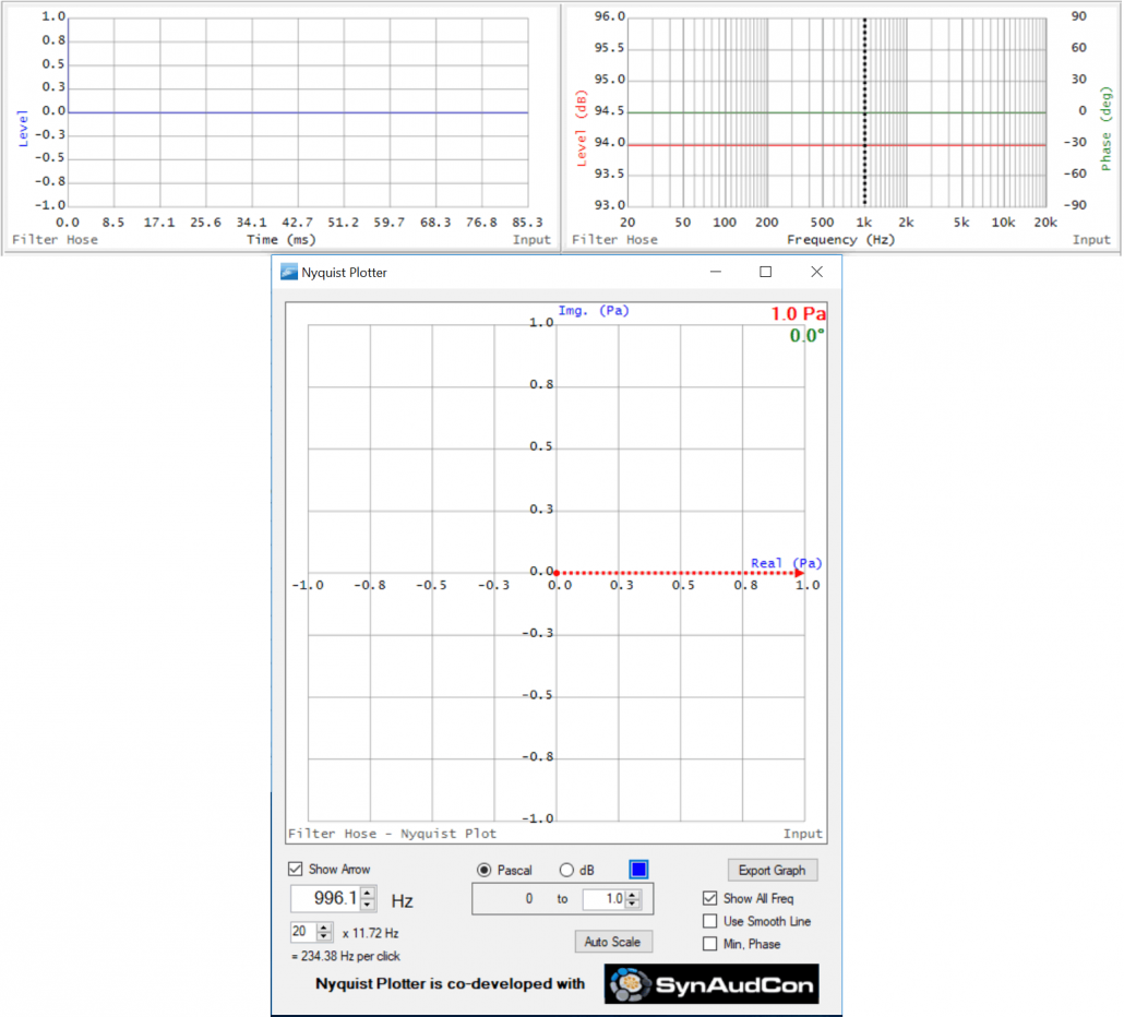
Figure 9 – TF and Nyquist of a Dirac delta function (impulse). ALL of the data points are at the tip of the arrow since they have the same magnitude and phase angle.
Ex. 2 – High Pass Filter (HPF)
I’ve applied a 100 Hz 2nd order HPF to the previous response. This causes the magnitude to roll-off with decreasing frequency, and this change in the magnitude response is accompanied by phase shift. Since the phase angle is zero in the passband well above the filter tuning frequency, the phase angle goes positive through the filtered region. On the Nyquist, this produces a short phasor at very low frequencies with a strongly positive phase angle. As frequency increases the phasor increases in length and the phase angle approaches zero. The tip of the phasor traces out an arc. There is no additional phase shift well above the tuning frequency. Note that at the tuning frequency (100 Hz) the magnitude phasor is at -3 dB and the phase angle is at +90 deg. This is the “half-power” point with 1/2 of the total phase shift of a 2nd order Butterworth filter (90 of 180 deg).
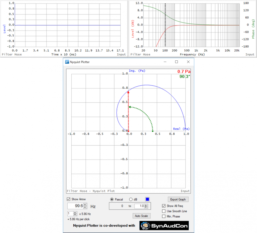
Figure 10 – TF and Nyquist of a high pass filter. The cursor is set to the 100 Hz tuning frequency. Note that the cursor in the TF tracks the cursor in NP.
Ex. 3 – Band Pass Filter (BPF)
I’ve added a 2nd order low pass filter (LPF) at 10 kHz. This causes the magnitude response to decrease with increasing frequency. Predictably, this change in magnitude is accompanied by phase shift. Since the phase response of an LPF is zero in its pass band, the phase slope (the same slope as the HPF) is negative. We now have a band pass filter (BPF) along with some important identities. The Nyquist plot of a BPF is always an ellipse, rotating clockwise with increasing frequency and passing through zero degrees phase at the center frequency. Memorize the shape of the phase of the TF and the shape of the Nyquist. Since all audio devices are band pass filters, we will see these shapes a lot, usually with additional baggage riding on top.
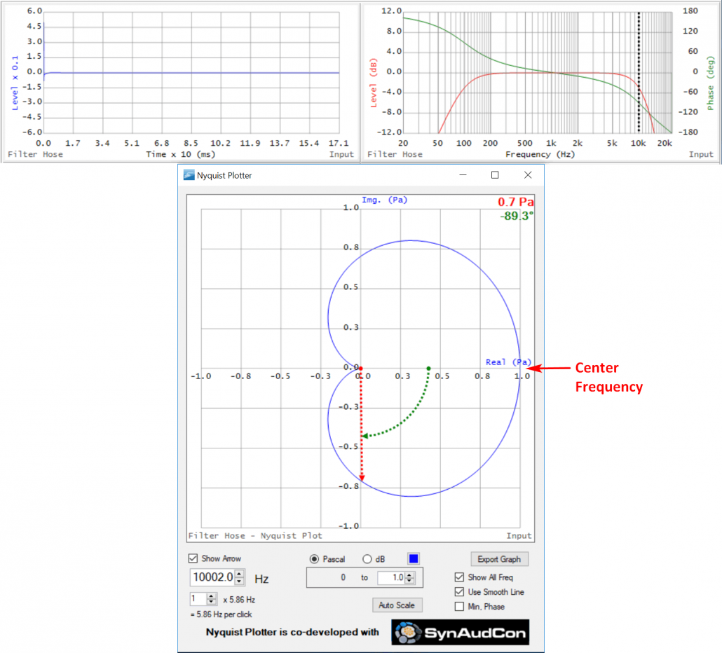
Figure 11 – TF and Nyquist of a band pass filter. The cursor is set to the 10 kHz tuning frequency of the LPF.
Ex. 4 – Boost Parametric Equalizer Filter (PEQ)
Here’s a 1000 Hz parametric equalizer filter (PEQ) that produces a +6 dB bump in the frequency response magnitude. Note the phase shift caused by the filter. I have switched to polar coordinates rather than Cartesian. Compare this to the phase response of the band pass filter. They have the same shape, with the phase being positive below the tuning frequency, passing through zero at the tuning frequency, and going negative above it. The ellipse is the signature of a minimum phase bump in the TF. If the filter is changed from a boost to a cut, the Nyquist would have the same appearance but the tuning frequency would be at the minimum level (on the left side of the ellipse instead of the right side).
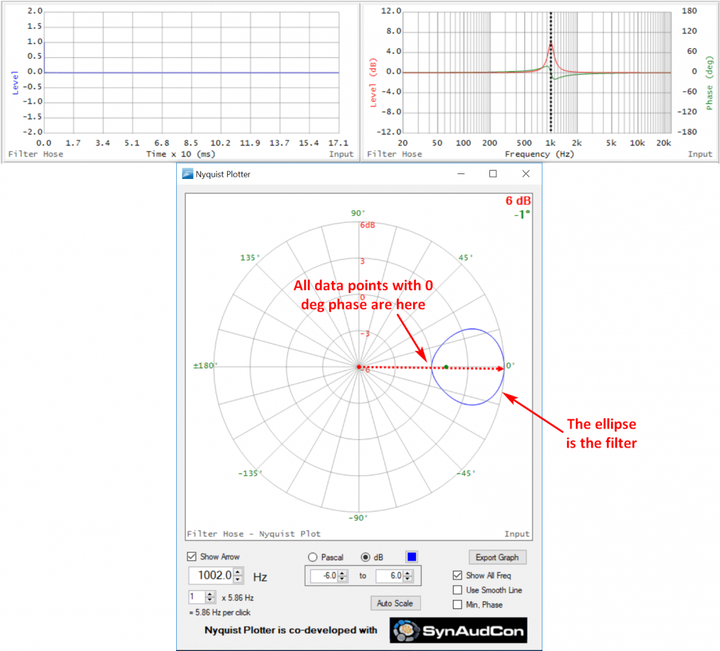
Figure 12 – TF and Nyquist of a PEQ filter. The cursor is set to the filter peak (maximum level, 0 degrees phase).
Ex. 5 – PEQ Riding on a BPF
Here’s a 400 Hz boost PEQ superposed on the original BPF. Note that while the PEQ center frequency goes through relative 0 degrees (center of PEQ ellipse) it’s riding on top of the BPF, so it has a positive phase angle (+17 deg). This demonstrates how multiple filters combine to produce a more complex shape – in this case an ellipse riding on an ellipse.
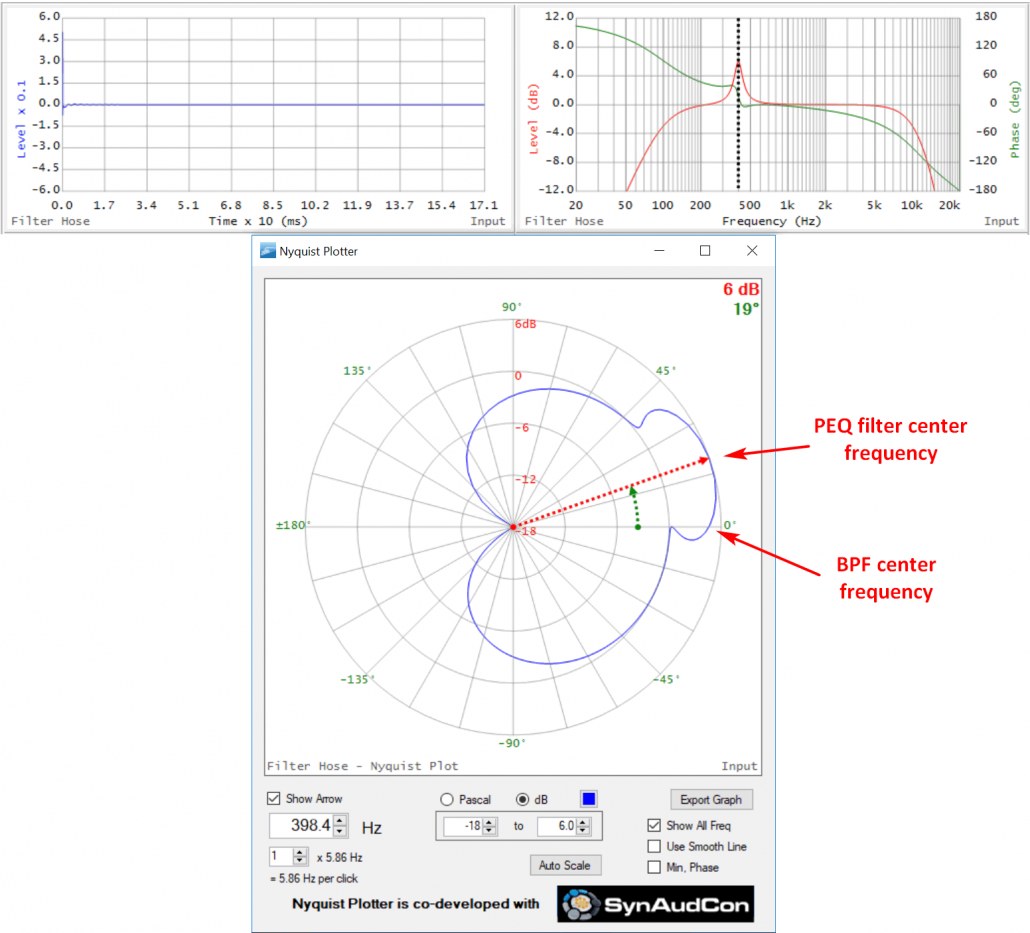
Figure 13 – TF and Nyquist of a PEQ filter riding on a BPF.
Ex. 6 – Boost PEQ and Cut PEQ Riding on a BPF
In Figure 14 I’ve moved the boost filter to 400 Hz and added a cut PEQ at 3 kHz. Note that ellipse formed by the cut PEQ plunges toward the origin. The ellipse formed by the phase shift is on the inside of the overall BPF ellipse. We now have a total of 3 ellipses produced by the phase shift introduced by the filters.
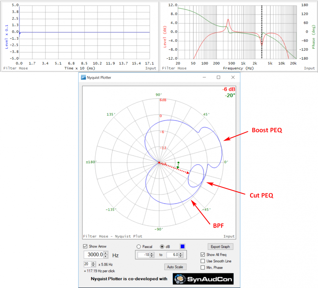
Figure 14 – TF and Nyquist of boost and cut PEQs riding on a BPF.
Ex. 7 – Conjugate Responses
Next, I have tuned both the boost and cut filters to 1000 Hz (Figure 15). They have disappeared on both the TF and Nyquist. Why? The filters are exact conjugates. The magnitude and phase responses superpose to completely remove any evidence of the filters. The response has been equalized. This is why I said earlier that phase shift is not necessarily delay, since delay cannot be corrected with a “prelay.” Causality cannot be violated.
This conjugation was possible because both filters are minimum phase. They exhibit the exact amount of phase shift suggested by their magnitude responses, and when superposed one ellipse cancels the other when tuned to the same frequency.
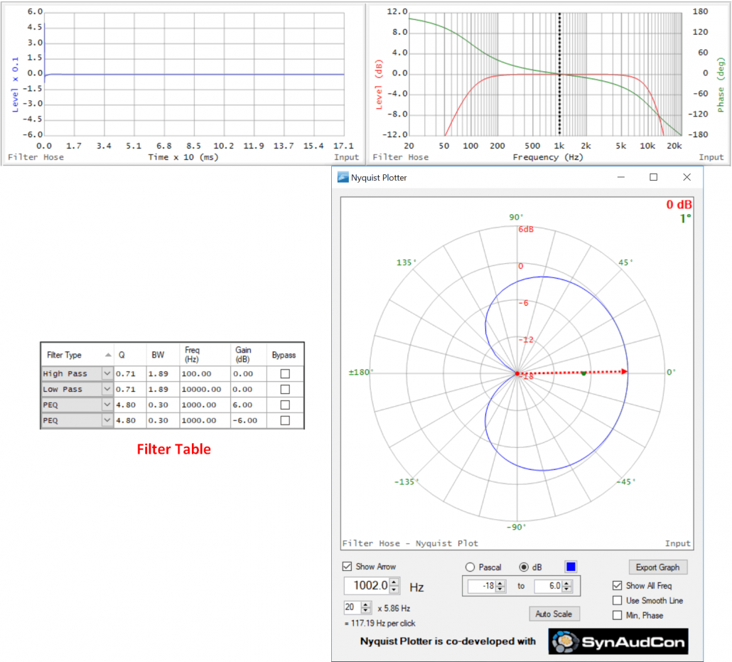
Figure 15 – TF and Nyquist of boost and cut PEQs tuned to the same frequency (1000 Hz). They completely cancel, leaving the overall BPF.
Ex. 8 – Polarity vs. Phase Shift
I’ll present one more filter signature in Part 1. Figure 16 looks like Figure 14, but the entire plot is rotated. Every frequency is phase-shifted by 180 degrees. This is the signature of a polarity reversal. While technically a phase shift has occurred, it is exactly 180 degrees at every frequency. This is unlike the frequency-dependent phase shift produced by filters. When someone says “change the phase” what they really mean is “invert the polarity.” When viewed in the time domain phase shift distorts the impulse response. Polarity inversion just flips it over. Neither action delays the signal.
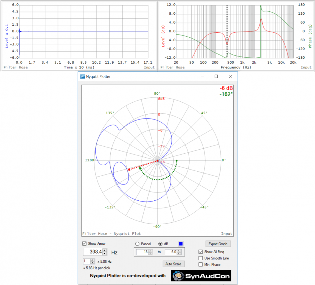
Figure 16 – Two PEQs riding on a BPF, inverted in polarity (compare to Figure 14)
Conclusion
The Nyquist response is ideal for examining band pass filters. On a TF plot of a band pass filter we expect a flat magnitude response in the pass band, and phase shift through the transition into the stop bands. It takes two plots to tell the story. On a Nyquist plot we expect an ellipse. One plot tells the story. The data is said to be complex because there is both a magnitude and a phase angle for the phasor. If the filter doesn’t exhibit phase shift (e.g. linear phase FIR) then on a Nyquist all of the data points will lie on the X-axis. It’s phase shift that produces the ellipses that the Nyquist so is adept at displaying.
All loudspeakers are band pass filters and exhibit phase shift. In Part 2 I’ll use the Nyquist to examine some loudspeaker transfer functions, which can get pretty crazy. pb
